The Metro hater's guide to customizing Windows 8 Consumer Preview

I’ve been following the ongoing debate over the Windows 8 Start screen with amusement and genuine sympathy. The common complaint goes something like this: “Touch-optimized Metro apps are great. The improvements to the Windows desktop are solid. But the Start screen, which serves as the hub between the old and new Windows, is too much new and not enough old. The transition is jarring, and ultimately doesn’t make me more productive.”
OK, I understand that point of view. In fact, I had a similar complaint when I first looked at Windows 8. Personally, after using the new interface for a while, I have come to like its overall design, but I also get how someone can look at the Windows 8 Consumer Preview with a much more jaundiced eye. I also see its long-term potential and expect it to improve and be refined over time.
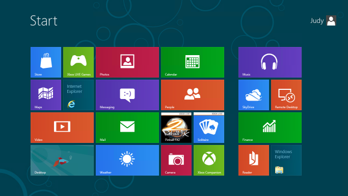
Frankly, I think a lot of the reason people have a negative reaction to the Metro style Start today is because the default presentation is so ugly and impersonal. Here, see for yourself:
By default, all 18 Metro style apps in the Windows 8 Consumer Preview are literally in your face, pinned to the Start screen along with tiles for the Store, Internet Explorer, and the Desktop.
If you install a Windows desktop app like Microsoft Office, all the icons that would have been dumped into the All Programs menu in Windows 7 are splattered across the right side of the Start screen
Taken as a whole, the result is messy. It’s a great way to encourage beta testers to try out the preview apps and thus get an idea of the potential of a future with lots of slick, well-coded Metro style apps. It is distracting and disorganized if you are trying to be productive today, in an environment where you mostly use Windows desktop programs.
The solution? Clear away the clutter and reorganize the Start screen into something more personal and more appropriate to your workflow. Once I did that, I found it was a lot easier to understand how to use the new Start. Here’s what the customized Start screen on my test machine looked like after getting my five-minute makeover:
No, your eyes are not deceiving you. I’ve also included custom Shut Down and Restart shortcuts.
The whole point of this Start screen is to make it easy to get to the desktop, where almost every technique you know by heart from earlier Windows versions still works. (Unless, of course, it involves the Start menu.) If you can get to the desktop, you can pin shortcuts to the taskbar, pick recent documents from jump lists, and use a variety of shortcuts to do stuff directly without returning to Start.
For me, being productive with the Windows 8 Consumer Preview means accepting a few realities:
- You need to learn new ways to accomplish some tasks. In most cases, I think your productivity will increase. Some specific tasks take more steps but are easier once you learn them. I really can’t think of a single common task that is significantly more difficult than using the Start menu in Windows 7.
- Keyboard shortcuts really make things simpler. That’s been true of Windows for as long as I can remember, but Windows 8 really takes it to another level.
- It’s OK to ruthlessly clear unwanted tiles from Start. If you expect your primary usage to be Windows desktop apps, you can safely remove just about all of those.
- The search box is your friend. Seriously.
In the gallery that accompanies this post, I explain in detail, with specific steps, how to give your Start screen a complete makeover so it becomes a useful gateway to the Windows desktop. I also introduce a handful of keyboard shortcuts that will make switching between the Start screen and the desktop much easier.
For the step-by-step instructions, see The Metro hater's guide to customizing Windows 8 Consumer Preview.
Here's what you'll find in that gallery:
- Introduction with before/after screens
- How to quickly remove tiles from Start
- How to change the Start screen background
- How to pin desktop apps to Start
- How to pin files and folders to Start
- Creating custom groups of tiles
- The hidden Zoom shortcut
- Renaming and rearranging groups of tiles
- Replacing the "betta" desktop background
- How to create a desktop background that perfectly matches the Start screen
- Uninstalling Metro style apps you don't plan to use
- Creating custom shutdown/restart shortcuts
It also includes the five Windows 8 keyboard shortcuts you must know:
- Opening the Charms menu
- Opening the Settings pane
- Searching for Windows settings
- Using the new program switcher
- Using the classic app switcher that recognizes desktop programs and Metro style apps
Related posts:
- Windows 8 Consumer Preview: a fresh start for Microsoft
- Windows 8 in detail (gallery)
- A closer look at the 18 built in Metro style apps (gallery)
- Getting started with the Windows 8 Consumer Preview
- Shortcuts and surprises in the Windows 8 Consumer Preview
- Windows 8 unveiled (Developer Preview)
- Windows 8: what you need to know to be productive now
- Windows 8 wish list: 10 Metro-style apps I want to see
- A deeper dive into Windows 8: can Microsoft’s big bet pay off?
- This new version of Windows? "I love it." "Oh yeah? I hate it."
