Business
YouTube lets us preview their new website
I have to agree with Haochi on this one -- the new YouTube preview makes me wonder what they are doing. Way too much red, which I hope is just because it's a "preview", and it feels like I stepped back in time to 1999 with the drop down menus everywhere.

I have to agree with Haochi on this one -- the new YouTube preview makes me wonder what they are doing. Way too much red, which I hope is just because it's a "preview", and it feels like I stepped back in time to 1999 with the drop down menus everywhere.
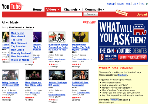
I am not a fan -- but like Haochi, that's just my my opinion -- it would be interesting to hear what you think of the new design. Was there anything wrong with the old one? For me, I don't really think it needed that much work. Post your opinion in the comments here, and then give your feedback to YouTube by clicking here.