AtScale expands COVID-19 data semantic model

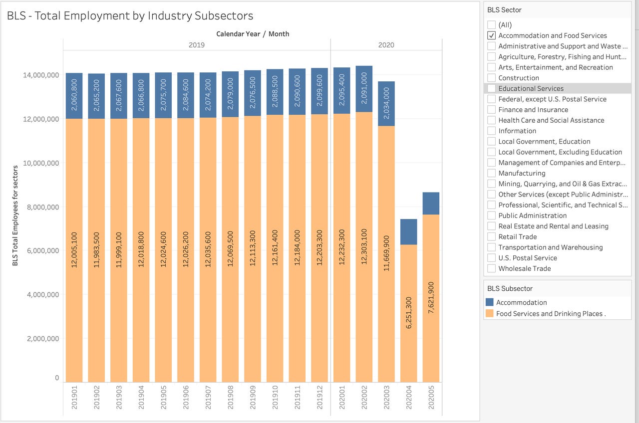
BLS data shows impact of COVID-19 pandemic on employment in the accommodation and food services sector
The intersection of the COVID-19 pandemic and analytics has been in focus almost since the pandemic began. Organizations like Johns Hopkins Center for Systems Science and Engineering (CSSE), the New York Times and many governments, including states and municipalities in the US, have been publishing data around a number of indicators, including case counts, hospitalizations, deaths and rates of positive testing. The data sets are downloadable in open formats, and available for self-service analysis.
But with so many datasets, new circumstances like in-progress re-openings and new spikes in infection, what's the best way really to make sense of the data? And what other data, not specific to Coronoavirus/COVID-19, might be useful and germane?
AtScale at work
I reported previously on AtScale's efforts at assembling an array of data sets and, perhaps more important, conforming the data and building a semantic model around it. Now AtScale has added important new aggregated economic and mobility data, from Google's Global Mobility, the US Transportation Security Administration's checkpoint travel numbers, OpenTable reservations, the US Department of Transportation's monthly travel statistics and the US Bureau of Labor Statistics (BLS) employment data.
Since AtScale is hosting the data, you don't need their product to analyze it; you just need to request access in order for credentials to be issued for you. From there, you can connect from your data visualization tool of choice, including spreadsheet and BI tools. AtScale even provides connection instructions for Tableau, Power BI and Excel. The company also provides an accompanying Tableau workbook, with many visualizations already built, to help would-be analysts get past the proverbial blank page.
Must read:
- AtScale, Databricks and others release advanced COVID-19 data resources
- Tableau makes Johns Hopkins coronavirus data available for the rest of us
Start off simple, add sophistication iteratively
I connected with the data model myself, from Power BI Desktop, in order to become more acquainted with it. I found the new version of the model very useful. The blending of data from disparate sources in a form that's ready to consume and analyze has a lot of value in itself, and some analyses can achieved extremely simply (for example, viewing unemployment numbers over time, for a particular sector, as shown in the figure at the top of this post).
Increasing the complexity slightly, you can juxtapose metrics that are pandemic-related (like cases counts) with those pertaining to "new normal" societal behavior. The correlation and, in some cases, lack of correlation between these different classes of metrics is instructive; monitoring the ongoing patterns even more so. The visualization below shows daily restaurant reservation rates, relative to the year-ago period, mapped against total case case counts, all just for Texas.
New York Times Daily case counts (bars), versus restaurant reservation percent change (line) data, for Texas.
Watch your figure
Scale matters. Metrics can have vastly different value ranges and some are based on growth rate, while others are based on straight value. Be ready to use visualization types that allow multiple Y axis scales, and make sure the metrics you're combining make sense to look at together.
For example, in the Texas visualization above, case count, ranging from 0 to 200,000, appears on the Y axis at far left, while restaurant reservation rate changes, ranging from -1.0 to to +0.2, shows on the Y axis at the far right. Which one affects the other, if any, isn't clear, of course. And reservations cycle up on weekends, then down during the week, so the dips and troughs shouldn't be over-analyzed. But being able to see all the data for oneself without the filter of a news organization's interpretation, is fascinating.
In other analyses, I discovered that the AtScale model makes filtering your friend, not just for obvious groupings like gender, age group, country or state, but also for policy-based binary categorizations like whether large gatherings have been prohibited, emergency declarations enacted, primary elections postponed or even if the jurisdiction had previously enacted a paid sick leave policy. In general, some dimensions work well on axes, some work best as filters, and some are great for either.
Model utility
There's so much COVID pandemic-related data out there that it can be overwhelming, and a pre-built semantic model can really help. Working with the pandemic data provides an excellent case-in-point for why business intelligence, performed on highly-curated, formally modeled data, can coexist with, and complement, exploratory analytics done on raw data in a data lake. There is utility in working with data that has been prepped, cleansed, conformed and modeled.
Again, parties interested in the AtScale data model and/or the the Tableau workbook built on it, can go to https://www.atscale.com/atscale-covid-19-data-request/ and fill out the form to request access. AtScale says it will then send credentials, connection instructions, and a link to the Tableau workbook. The company will even entertain requests for new dimensions, hierarchies and measures.
Self-service analysis of pandemic data won't solve the COVID crisis, but it can help us understand it better and, hopefully, direct our behavior to better collective outcomes. As Chris Lynch, AtScale's Executive Chairman, CEO and legendary Boston database/analytics VC put it, "Our overall goal of enriching our COVID insights model with economic and behavioral data is to not only help organizations tackle the challenges they are facing, but to help better understand where we are on the collective path to normal."