Pebble Time first (likely last) impressions: Poor indoor visibility, solid hardware, calendar focused-UI

If you are an iPhone owner who is curious about a smartwatch and don't want to commit to an expensive Apple Watch, then the Pebble Time may be a good option. If you are an Android smartphone user, there are similiarly priced Android Wear options I recommend instead.
Check out the full CNET review that awarded the Pebble Time a 7.8/10 rating.
Hardware
As you can see in my image gallery below, the hardware is a major improvement over the Pebble and Pebble Steel with a smaller form factor, better steel and plastic build quality, and a microphone.
Apple Watch
The display is now color e-paper technology, but I wouldn't say it's really an improvement over the monochrome e-paper display on the first generation Pebble.
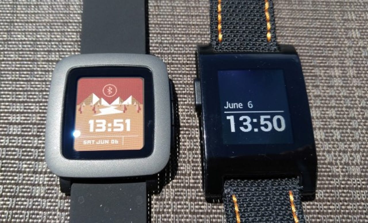
I am having trouble seeing the display in normal indoor lighting conditions without turning on the backlight and even with the backlight on I am not at all impressed. My experience with smartwatch displays has been spoiled with the Apple Watch and Android Wear devices so I could personally never go back to something like the Pebble Time.
The display looks great in sunlight, but here in Washington that means I will be able to see the watch display for two or three months. The watch photos on the website showing the display are not what you can expect in person and I am very disappointed in the display visibility in normal indoor lighting conditions.
I understand that the use of an e-paper color display was a strategy to keep the costs down and provide longer battery life, but I take my watch off when I go to bed so don't really care if a watch goes longer than a full, long day. It's easier to remember to place a watch on a charger daily than it is trying to remember and keep track if 3, 4, or 6 days works for a certain watch. Since I've only been using the Pebble Time for just over three days, I can't yet judge the battery life.
The hard plastic back and metal bezel appear to be very well done. The front bezel is pretty wide and inside the metal bezel is another wide black bezel all around the display. The looks to be set down below the glass quite a bit. I get the feeling that everything is rather old tech, which may have a bit of a nostalgic appeal to the techie crowd.
There is one button on the left to activate the backlight and three along the right side. The buttons are made of the same polycarbonate as the back, but are much better designed than the ones on the original Pebble.
There is a microphone opening below the bottom button on the right side, which can be used for functions such as text replies.
The included soft silicone band feels just like the one that shipped with my original Pebble. Pebble uses the standard 22mm band design so you can swap out with other bands as you desire.
The Pebble Time is 40.5 x 37.5 mm and 9.5 mm thick. It weights in at just 42.5 grams, with the included silicone band.
Software
Pebble updated the software on the Pebble Time, with a focus around using the three right buttons for its timeline interface. The top button provides quick access to the past, the bottom to the future, and the middle for selecting things in the present.
I personally don't really care what happened in the past so find little use for the top button. You can also program the top and bottom buttons for quick access to selected apps by pressing and holding down on each button.
It's helpful to look ahead and see what is coming on your calendar so I do use the lower button quite a bit. Pebble uses quirky, cute animations and icons throughout the interface that may appeal to a younger generation. They aren't very professional and I don't think you will want to be showing them off to the chief executive officer.
Pressing the center button from the watchface will take you to the app launcher. Press the up button once to jump to the settings area and then use the center button to select things while using the up and down buttons to scroll through options.
If you don't press a button after several seconds, the Pebble Time will go back to the watchface.
Unlike the previous Pebble where you had a certain number of slots you could fill with apps, you can load up as many as the memory will hold on the Pebble Time. Pebble states this could be 50 to 100 apps and watchfaces.
You can manage your apps using the new Pebble Time iOS or Android smartphone app. Within the settings on your phone, you can select which calendars sync to the watch and adjust other settings on the Pebble Time.
After setting up your notifications, the experience is much more limited on an iPhone, you will start seeing them appear on your Pebble Time. They are dismissed with button presses, which is a bit tough to get used to after using touchscreen smartwatches for a while.
The experience with notifications is a bit limited and I great a bit frustrated by the lack of information available on the Pebble Time. I often had to open the notification on my phone to see the full message and really did not find the Pebble Time that useful.
There are quite a few apps for the Pebble platform, but not yet that many optimized for the color display. While Evernote, ESPN, Jawbone, and a few other big names are there, the Pebble Store is primarily full of independent apps with experiences that vary all over the place. I found some decent watchfaces, but overall I am just not as impressed with the Pebble app selection as I am with Apple and Android Wear offerings.
There is no GPS in the Pebble and overall it does a poor job as an activity tracker or motivator. Even without GPS, the Apple Watch does a solid job of serving to get you up and moving while some Android Wear devices even have GPS and a heart rate monitor.
Closing thoughts
When you look back at my list of five things the Pebble Time can do that the Apple Watch can't, you can see there are a couple of real advantages. However, I've now experienced both watches and the fitness functions are better on the Apple Watch while there are no smartstraps yet available so its usefulness remains to be proven.
The Pebble Time seems to primarily make sense for those who are focused on their calendar and have a ton of appointments to manage. I have some appointments, but spend more time working than I do in meetings so am just not seeing the usefulness of the timeline interface.
The primary reason I will likely be selling my Pebble Time soon though is that I just can't stand the display quality. The Apple Watch display looks fantastic, as does the display on the Moto 360 and LG Watch Urbane.
Reviews of the Pebble Time vary from ratings of 6 to 8 and at this time I would agree with the lower ratings. My ZDNet colleague, Kevin Tofel, should be getting his Pebble Time this week and it may be up to him to provide you with further coverage as mine is likely hitting Swappa soon.