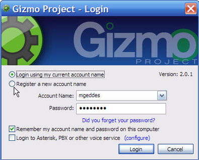
What I'd change about Gizmo Project's Login screen


Martin Geddes of the independently-run Skype Journal is not what you would call a huge fan of the Gizmo Project Login screen.
While I love and use Gizmo, I tend to agree with Martin's assertions that the screen layout can be confusing, with what he calls a "high cognitive load."
Martin doesn't like the placement of the "Login using my current account name" and "Register a new account name" radio buttons above the Account Name pull-down menu.
I agree. The radio buttons should be below the Account Name and Password boxes, or better yet, should disappear from the Login screen if and only appear as a default if you don't have an account name, or if you've entered the wrong account name and password.
"The drop-down text entry box is the wrong cue for creating an account name," Martin writes," because it implies a selection of existing data."
In other words, the user is going to see an Account Name pull-down menu regardless of whether or not he has created one.
Plus, may I add, the average user will probably only have one account name. Why present an account name pull-down menu, with its implication that more than one user name does- or at least should, exist?
And then I am wondering why the huge Gizmo Project logo and wheel. Seems to me that Gizmo is taking up valuable screen space by hitting users over the head with yes, sir, we're the utility you've just called up.