Apple's new iMac. Wait, is that a huge, slightly ugly iPhone?

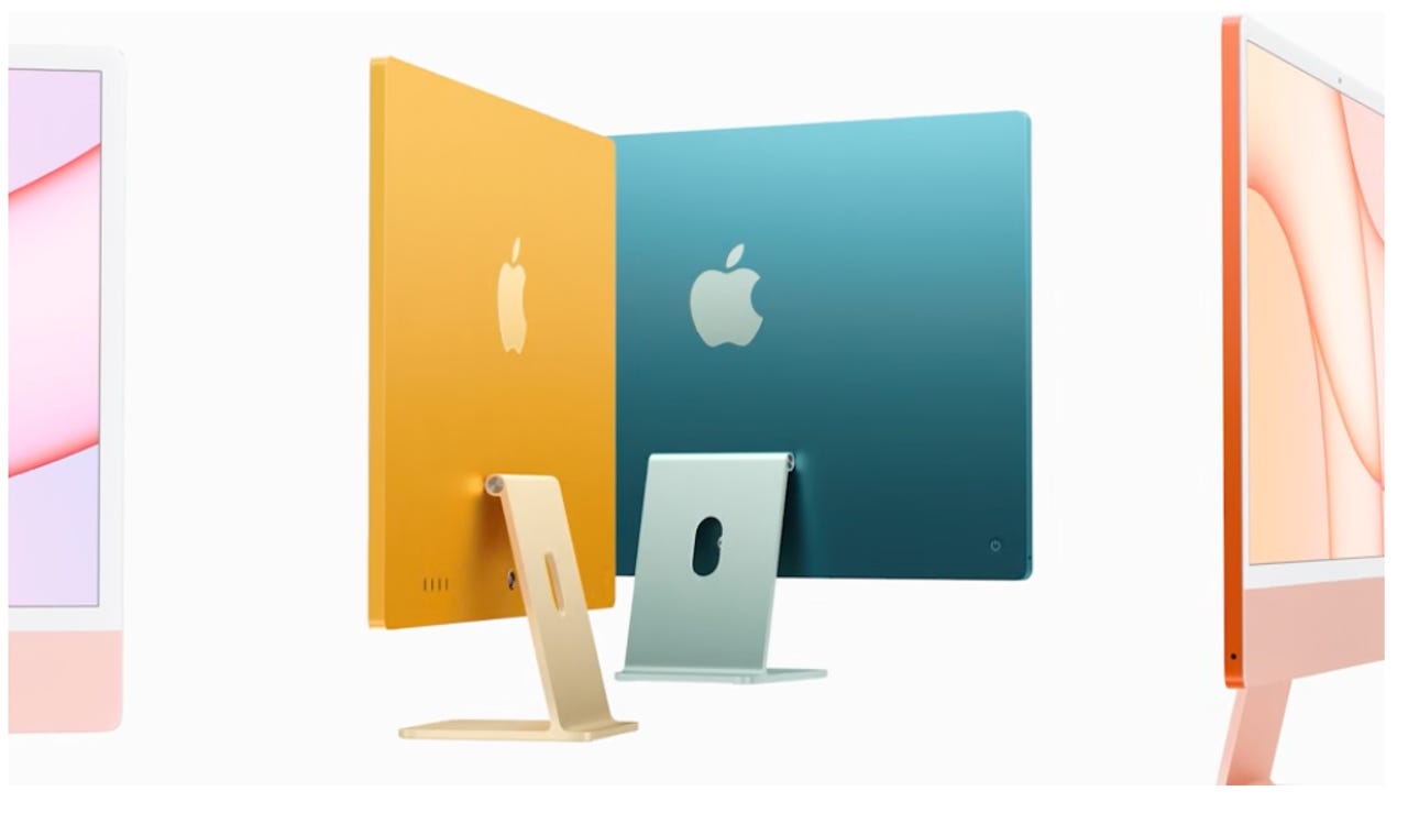
Lovely from the back, no?
Apple knows how to take me back to happy times.
Why, my iPhone 12 reminds me of the joys of iPhone 5, bathed in a deeply intellectual blue. At least on the back.
Naturally, then, my first reaction on watching Apple's event last Tuesday was to wonder whether, had it been available at the time, I'd have wanted my iPhone 12 to be colored purple.
Why did Apple have to choose April to suddenly release something so, well, spring-like?
But before I could become truly at one with my consternation, there were the new iMacs. And what joy. It seemed as if one suddenly has the choice of all the colors of the rainbow in Apple's logo.
Would I choose one to match my iPhone? Or perhaps it's better to find a contrast. The orange, perhaps? And wait, is that a purple iMac I see before me?
Yes, this was all a pleasing homage to the original, gloriously bulbous, giddily colored iMacs of yesteryear.
But now the iMac is thinner than a politician's intellect.
I'm not sure why it has to be. It's not as if you'll stare at it from the side too much, unless you have particularly odd proclivities. But Apple has always had a severe interest in proving to itself that users can cut themselves on the edges of their gadgets.
Yet when I looked at the whole thing, somehow it was the back that was fetching and the front that was, oh, let's talk about the back.
Apple
It was as if the designers had been inspired by the iPhone. Put the logo on the back. Make it one lovely, solid, vibrant color. There. A big, gorgeous iPhone.
And when it came to the front, the designers ran out of time. Or something.
Perhaps it's just me -- and I do realize aesthetics are subjective to all and irrelevant to many -- but the front of these new iMacs resembles a handsome man who grew a beard and regretted it.
If you thought the goal was minimalist, with the screen maximized for your visual pleasure and involvement, here you have a jarring jaw and chin.
It's a mere five years ago that Microsoft emerged with the upliftingly minimalist Surface Studio. It actually made Apple's wares too remarkably prosaic. The latest version follows up that approach, with a clean, inviting screen.
Yet Apple's latest iMacs seem to want you to stare at the unsightly element of their faces, rather than their attractions.
Then there's the curiously white bezel. It's as if Apple had a lot of white iPhone 8 bezels left over and molded them around this iMac and into its slightly offputting bottom.
You'll tell me aesthetics really, really don't matter. You'll tell me the M1 chips inside these things will propel your work to unimagined heights. And I'll agree with you, even if I've never seen your work.
I'll even concede that this is a homage of sorts to the previous 27-inch iMac. With the Apple logo taken off the front and put on the back in order to make it look more like a vast iPhone.
But it's like a car when they tell you it's been completely redesigned and doesn't quite feel like it.
Perhaps it'll be the next 27-inch iMac that'll be really, really redesigned.