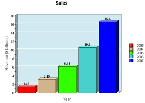
Google's annual report by the charts

Google recently filed its 10-K with the Securities and Exchange Commission and dished out the usual batch of figures, but the charting the growth tells the tale.
Here's a look at Google's annual report by the charts and some of the more interesting items.
First up, the revenue growth is stunning. But we knew that already.
Meanwhile Google owned sites are generating most of the revenue growth in advertising.
And the company is becoming less reliant on the U.S. for its revenue stream.
But this growth has its costs. The R&D spending ramp is just as stunning. What's the ROI picture on that load of cash?
Total costs are also ramping up. As percentage of revenue though there's nothing too worrisome, but the numbers are big--real big.
Google nearly spent $1 billion in 2007 on IT assets. As you can see from the following chart, Google has a lot of stuff.
Another nugget worth highlighting is Google's doubtful accounts balance at the end of the last three years. It's up sharply in 2007, but so is revenue. However, it's always good to monitor whether customers can pay their bills. This chart highlights the jump.
