iOS 7 review: Apple's mobile mid-life crisis?

Apple's upcoming version of its iPhone and iPad platform ends a cycle of iterative graphical updates by radically overhauling the visual experience.
Now boasting blurs and layers, tucked-away features, and transitioning animations, it will be enough to keep some of its users interested and intrigued, and familiar enough to remove a learning curve. Fundamentally, it is vastly the same operating experience as iOS 6, but it still throws a few curveballs in to baffle and perplex.
For 30 days, I was running a pre-release (though regularly updated with new versions) iOS 7 on my iPhone 4S. The challenge was to go a month running the software to see how it stood the test of time; a few hours or even a few days are seldom enough to judge a new software bundle. Over the long term, a minor annoyance can become enough of a reason to switch platforms altogether.
This article will focus all but entirely on the user interface and redesign of the experience, as they were the greatest overall changes to the platform.
The software at this point, which ran through several updates throughout the 30 days, was buggy and clunky in places. This piece is not intended to focus on crashes and bugs, as these were expected and do not represent the full, final, and finished state of the software. The purpose of this review was to see if a relatively average user could cope with forced change on a scale that iPhone and iPad users would have to adopt in the coming weeks amid the arrival of the next iPhone.
In spite of its pre-release status, visually it is all but complete, with only minor tweaks and changes that remain the sole focus of this review.
But despite what some are saying, while the visuals have changed notably from the first through the fifth beta, released each week since it was first shown off in mid June, the visuals, aesthetics, design points, and overall user interface and experience are as good as done.
The "too long, didn't read" version: While the surface has changed significantly, little has changed under the hood. And while it's both exciting and daunting trying something that appears new, many — if not most — will find satisfaction and security within moments of using the software.
I think that above all else, new users may on the whole enjoy the experience. If there is an emerging market iPhone on deck for September, as sources suggest, iOS 7 will go out to a vast number of newer users. Even existing users will appreciate that the greatest change is an overlaying theme or "skin" that has left intact much of where one would expect to find things.
But the inability by some to adapt to a "visual overload" of features and design points may alienate a significant portion of users — not only after they upgrade, but also (and more importantly) before. This, in turn, could lead to fragmentation of the iOS market, which has up until now been a significant leap away from Android's array of software versions still in action.
Here are some of the main takeaway points on the design front.
iOS 7's foundation is built on 3D effects and faux-perspective: Why? Why not
Having first-hand experience of the software now explains why those who saw iOS 7 before it was announced in June said it looked "flat" in comparison to earlier versions.
In fact, Apple is right to call it "layered", because there's not a better way of describing it. There are a lot of moving parts when you look at the software's visual design, and if you take one bit away, it can quickly fall apart, or even look "wrong" on its own.
Your home screen is split into two: A dynamic, moving wallpaper (more on that later) with "flat" icons, giving a sense of levitation. The lock screen feels even further away. When the device unlocks, the icons gently fall onto the home screen in two parts, halved vertically down the middle. Both sides drop their icons as though they are falling onto the display.
And then you have the Control Center, which across all aspects of the device, locked and unlocked, slides out from the bottom of the screen like the bottom half of a barn door.
But on top of even that, then you have the Notification Center as the first-and-foremost "top down" layer. With a translucent and blurred background of its own, it gives a further sense of how layered the software's design feels. Knowing you can see the blur of the home screen icons means it hasn't gone away, and you can just swipe back to where you were before.
In a sense, it's as though you're in a maze of guillotine-like layers. The drop-down and draw-up panels feel razor thin in weight, thanks to the responsiveness and a lack of drop shadows.
Icons appear haphazard in design, and there's little reasoning behind the color schemes
New icons with colors would throw off even the most seasoned iPhone and iPad users. Rarely do users look at app names — we are drawn to the icons, which over time build familiarity. The changes in iOS 7 force a relearning process, which, as a seasoned user, soon becomes frustrating.
Individually, native app icons appear flat. (Facebook and Twitter icons still retain their "depth," but when sharing photos within the operating system and away from the home screen, these icons follow similar schemes to the rest of the device's apps). Native icons appear bright in color, bold in contrast, and far sharper and refined than in iOS 6. This is likely in a bid to take advantage of the fact that the software will now only be available on Retina display devices, from the iPhone 4 and above.
The icons in iOS 6 devices gave the device depth. The rounded edges of icons and shadows almost tricked the eyes into thinking the icons were hovering above the wallpaper. In iOS 7, there are no shadows to give perspective.
And while the icons still have rounded corners, they are simpler in design. Icons are no longer complex, and use simple per-icon color schemes.
The icons also don't appear to follow any consistent design scheme. The patterns are bipolar in nature. Some native icons are intricate and have "what you see is what you get" imagery to represent what the app looks like within. Others merely indicate what an app's primary purpose might be, such as the Clock with a clock-face icon, and so on. Others do not fit into either end of the complexity spectrum. They have varying levels of multifaceted imagery, but require you to double check whether the app being accessed is what was intended.
After a few days of use, it becomes instinctive and easier to remember what the icons look like and where the apps are placed. But one cannot escape the feeling that these icons have been changed "because everything else was changed." In fact, it was probably not necessary to change the icons at all in such a brutal way, and led to an immediate feeling of discomfort.
Dynamic wallpaper is unique, but spooky: There is no doubt it's nothing more than a clever gimmick
iOS 7 has added a relatively simple, albeit powerful and actually quite impressive, feature to its background.
Some might suggest that the idea was "stolen" from Android. I would disagree. The concept was, perhaps, but the finished feature is far from a full-on animated wallpaper. Google wanted your device to feel alive and vibrant, while Apple wants a sense of perspective and gravity (in the literal sense). And here's what it looks like:
A combination of the internal accelerometer and gyroscope working together creates wallpaper that moves just enough to add an area of "space" within the device. One must admit that while this feature is impressive, it's subtle in the real-world setting. It can also be a little choppy at times — something like that will be weeded out over extensive testing.
These static wallpapers very gently and faintly move — "adjust" is likely more appropriate — to counter the way in which you hold your phone. In doing so, the moving background gives the impression that the icons have pulled away from the wallpaper and separated out. But the illusion is easily lost on the eyes.
This apparent "particle engine" also extends to dynamic wallpapers, which only included two during the beta. These are not images, per se; they are more reminiscent of a lava lamp that adapts to the axes that you hold your device on. The spheres in this case move like a wooden ball game, and can be controlled to an extent by the user's hand movements.
There isn't much point to it, at least on a practical level, except for the fact that it remains the foundation of the operating system in more ways than many will first believe. Its iOS 6 predecessor had very little focus on the wallpaper — relegated to the home and lock screen, where, more often than not, it was masked by icons and notifications.
The color of your background dictates a great deal device-wide, and sets the tone and scheme of all kinds of things
Sticking with the theme of wallpapers and backgrounds, the wallpaper may well be, in spite of the blurs and effects and the text on-screen, the most looked-at part of a smartphone's operating system.
iOS 7 brings the wallpaper not only to the forefront of the user interface, but makes it the cornerstone of the platform itself.
Thanks to the thick, translucent blurring, in conjunction with the layering effect discussed earlier, as everything is centered on the home screen and wallpaper, the colors bleed through to other slide-in layers. On the lock screen, the Control Center, and the Notification Center, the colors filter through the frosted glassy layer. To complement this, the software picks out the most prominent colors and feeds them back to the user in the form of button controls and other touchable items.
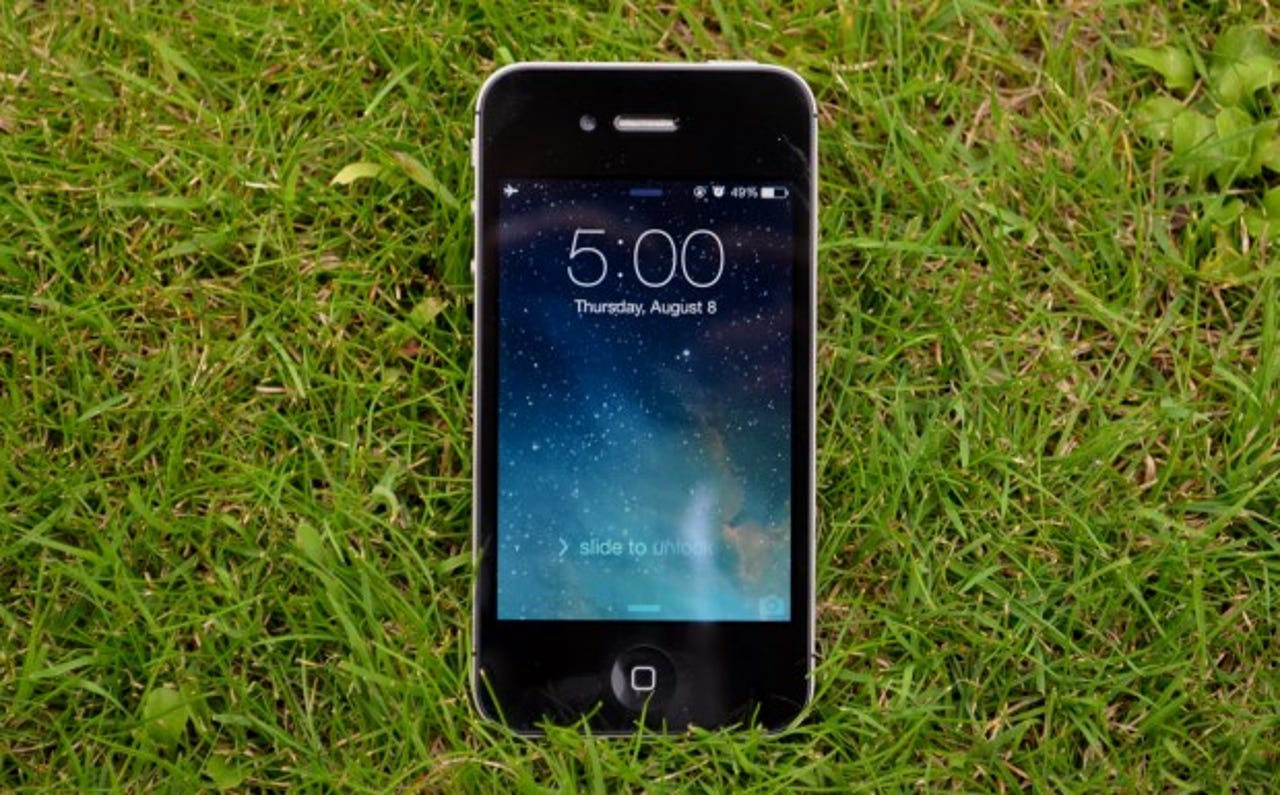
You can see the difference in the two wallpaper color schemes: On top is a galaxy-like image that's predominately blue, while the bottom is a grassy picture with strong green hues.
Smaller issues can quickly frustrate; it's difficult when you have to break long-running habits
In earlier beta versions, for neither love nor money could I work out where Spotlight, the device's search functionality, was located. By sheer chance, a rogue and erroneous swipe-down gesture discovered it tucked away between the clock and signal strength indicators and the top row of icons on the home screen.
A later beta and subsequent versions included a small popup to explain, "Spotlight has moved." But this logic once again falls into in the "I don't know why you did this" category.
Moving something for the sake of moving something seems to go against the grain of keeping customers comfortable by consistency. Users expect something to stay mostly the same release on release, unless it was so inherently flawed in the first place that it had to be changed. This may well be known as "Start menu syndrome," following the uproar over the Start menu being removed in Windows 8. By discarding an integral part of the software that had been there for more than 15 years, it caused a backlash that resulted in its reinstatement.
And there was a lesson there.
Apple has been accused of by some of "stealing" ideas from others. The translucency from Windows Vista's Aero theme; dynamic wallpapers from Android; even application card-like multitasking from now-defunct Palm. There is a strong temptation to say, "So what?" Yet, one might hope that Apple would have learned from some of its rivals' misadventures and downright failures.
Alas, not always. For example: Double-press the home button to reveal live app multitasking, sans the quick-access features that were already there — volume and brightness controls, rotation lock toggles, and quick access to music controls. There was no real need to force change. But for the sake of saying, "we made this better," it was changed. Now it requires a relearning process by users. It's passing the buck and the blame onto the user to figure it out.
These are just two in a catalog of minor, seemingly inconsequential things that have left me scratching my head, questioning simply: "Why?" Change is good. Change is sometimes necessary.
But the fact that Apple has to include a note to inform users of the Spotlight change seems a little lazy, frankly. It goes against the grain of what appears "intuitive" to the experience.
3D animations take some getting used to
The animations look great, and while they are smooth in transition, they slow the feel of the device down. And while it arguably further adds to this running depth drive that Apple wants us to feel, it feels superfluous and over the top.
Making the most out of a bad situation, it's worth noting that comparative to iOS 6, where everything was already there and rendered beforehand, iOS 7 dynamically adapts to the environment it's in and adjusts as it goes.
The animations and transitions are smooth and flawless. But over the course of 30 days, they become tiring on the eyes and gradually felt repetitive.
Over time, I found myself waiting for animations to complete. Even though they only take a half-second, it was enough to feel as though my productivity was being stifled, so that it became irritating over time.
Native apps open quickly, as one might expect, but in some cases, Apple apps and third-party downloadable apps that are installed later can still take a few moments to load. This only adds to the delay and cumulative frustration.