Microsoft is right, the classic Start Menu is inefficient, but I'm not sure the Start Screen is the answer

What follows are my thoughts and feelings related to Microsoft's latest post over on Building Windows 8 about the Windows 8 Start Screen.

Before I begin
Before I begin, one point I want to make. I've been using Windows 8 now on several setups for many hours, and overall I've very pleased with what I'm seeing. The OS features many improvements that I feel will be of enormous benefit to home, small office and enterprise users alike.I like Windows, and I like Windows 8.
A lot.
But.
I'm still not convinced that Microsoft plan to shove a touch interface into what is essentially isn't designed to be used that way is flawed, and I'm worried about what effect this may have on both users and the Windows ecosystem in general.
Some assumptions
I'm going to make one assumption here about the PC landscape during the years that we can expect Windows 8 to reign (2012 to say 2015). That is that touchscreen technology on the PC (both on desktops and notebooks) won't become mainstream in this time and that the default input devices that most home and business users will be relying on will still be the humble keyboard and mouse. I make this assumption with absolute confidence. Sure, we're going to see touch-enabled PC from OEMs, but these will feature a premium price tag and as such remain high-end, luxury items. As far as the budget and mainstream markets are concerned (and those two categories will represent over 85% of Windows 8 users), Windows 8 might as well not be touch-enabled.In other words, touch might one day be big, but expecting it to go big during the three or so years that Windows 8 will shine for is crazy.
Solution looking for a problem
So, what Microsoft is proposing to do in Windows 8 is replace the Start Menu, something that even I admit is kludgy and even with the best will in the world can rapidly degenerate into a confusing hellstew, with a mechanism that's designed primarily with touch in mind. Sure, you can drive it with a mouse, but the overall idea here is to make it capable of being driven with the simplest pointing device - the finger. Problem is, that's not going to be an option for the majority of Windows 8 users. So in other words, Microsoft is making sweeping changes to the OS for the benefit of a tiny minority or users.And there, in a nutshell, is the problem with the Start Screen - it's a solution looking for a problem to solve. If people were clamoring for touch-enabled PCs then the Start Screen makes sense, but they're not, and they're unlikely to be for the foreseeable future.
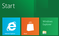
I have a question for Microsoft. Exactly how is this (something that to me looks like a throwback to the Program Manager days of Windows 3.1) ...
... any easier (to use and on the eye) for keyboard and mouse users than this ... ?
Both involve scrolling, but at least the Start Menu focuses the eye and the user's attention on a small portion of the screen.
Fitts' law
In the blog post over on Building Windows 8, Marina Dukhon, a senior program manager lead on the Core Experience team, spends a great deal of time talking about Fitts' law. Don't know what Fitts' law is (shame on you!)? It's used to model the act of pointing, either by physically touching an object with a hand or finger, or virtually, by pointing to an object on a computer monitor using a pointing device (and yes, I did get that from Wikipedia!).How does this fit in with Windows 8? Well, Fitts' law can be used to create a heat map to show how long it takes to reach specific areas on screen. Microsoft has done this for both Windows 7 and Windows 8. Here are the results:
More of the screen is easier to get to for users using the Windows 8 UI than there is on Windows 7 ... but an awful lot of that screen is still red, and that means that those areas are still slow to access.
Note: What's interesting about the heat map for the classic Start Menu is that it backs up the theory I had that pinning items to the top of the Start Menu wasn't the best idea and that pinning to Quick Launch was faster and more efficient.
Another Fitts' law factor that's taken into account is the size of the object that you're trying to click on:
So, to counteract distance that you pointer or finger has to move, Microsoft has made the targets that people are aiming for bigger on the Start Screen. Again, in many ways I can't argue with this when it comes to a touch interface (except that on touch-enabled desktops, where having to wave your hand across the whole screen is likely to be cumbersome and get real old, real fast). Your finger is not as precise as a cursor and you need that extra space to prevent accidental 'clicks'. But why spread all the stuff across the screen unnecessarily for desktop users with a mouse? Across a big screen it makes little sense, across multiple monitors it's insanity. You'll end up having to scan the whole screen looking for the application you want to run. What's more, you'll have to scan the whole screen each time you scroll the screen.
The Start Screen - A new hellstew waiting to happen?
Here's another worry that I have related to the Start Screen. As smart as it looks in Microsoft's screenshots which have a controlled number of applications installed, what's it going to look like a few years down the line?What's the Start Screen going to look like once installers are done installing all the crap onto the Start Screen (readme files, help, unistallers ... stuff that shouldn't be in the Start Menu any more but it)? Is the whole thing is going to end up becoming a new horrid hellstew of its own, with icons for applications strewn across the entire screen?
If having my apps spread out across the screen was actually better than having them in the Start Menu, I'd already be putting my applications links on my desktop. The fact I'm not already doing this says something.
What, no classic Start Menu?
So, if you don't like the Start Screen, you'll be able to disable it and go back to the classic Start Menu, right?Maybe not.
So far, there's no indication from Microsoft that the classic Start Menu will be available 'officially' in Windows 8. Whether the lack of an official 'on' button for the feature is by design of a trial balloon to see what people think is unclear at present. Maybe Microsoft will eventually back down. That said, I can understand why Microsoft might not want to make it easy for people to disable the Start Screen. If the Start Menu was available as an option, it's very likely that the Start Screen would wither away and die as the majority of users went back to something that they know and has worked well so far.
Closing thoughts
Speaking subjectively, I don't like the Start Screen. It already feels kludgy and awkward. Rather than one huge wasteland for all apps to go into, I'd much rather if there was a way to organize the apps using tabs or something ... and I'm no fan of tabs! Speaking objectively, I don't see the point of the Start Screen when the majority of users aren't going to benefit from it. It's change for the sake of change and unless Microsoft pulls a rabbit out of a hat in terms of making the whole thing far more usable between now and the beta, I predict that it will be seen as a huge mess and something that may cause users to shun Windows 8 in greater numbers than they shunned Vista.Maybe Windows 8 will indeed turn out to be Microsoft's riskiest product.
<< Home >>