Mozilla unveils Windows theme/UI update for Firefox 3.7/4.0

Mozilla have unveiled some mockups of the Windows theme/UI updates that is scheduled to hit Firefox users over two stages - 3.7 and 4.0.
Stephen Horlander, a designer and contributor to the Mozilla project unveiled some details of the refresh.
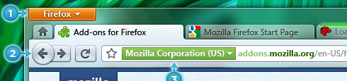
Cornerstone to the revamp is the App Button that appears in the top-left of the mockup. Here's what Horlander has to say about the origin of this new addition:
The new proposed approach to this problem is an App Button which is similar to the single menu approach taken by Windows 7 native applications (Paint, WordPad) and by MS Office.
According to Horlander, the App Button solves a number of issues:
- It is less complex
- Takes up less space
- Instead of two potentially conflicting locations for menu items, there is now only one unified location
- Can be placed in the upper left analogous to the Menubar paradigm it is replacing
- Similar to the far more ubiquitous Office 2008/2010 + Windows 7 application menu
- Reduces clutter on the Navigation Toolbar
- It also creates a more flexible and rich canvas for perhaps doing some decidedly non-menu-esque things
Here's a side-by-side comparison of Firefox 4.0 and the current 3.5:
Mozilla seems to have managed to reclaim a fair bit of screen real estate with this move, which is a good thing. I like it as it really cleans up the user interface.
Expect to see a public release of Firefox 4.0 mid 2010 and the final release during the final quarter.
So, what do you think?