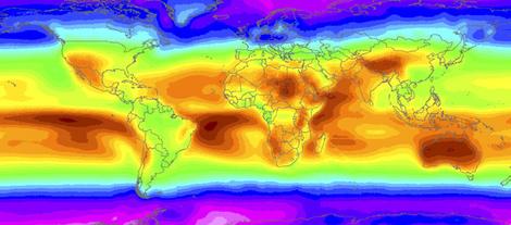
NASA maps world's hot spots, a road map for solar?


NASA is releasing a color-coded map of the entire planet's solar exposure. The sunniest spots show up as bright red. A British paper reports the informationon sunniest spots is already influencing the location of new solar generation plants.
Here's what they reporeted, "Using satellite data for Morocco, Portuguese company Net Plan worked out how many solar photovoltaic panels were needed to power a remote relay station for phone signals. It worked and a costly backup of diesel generators was removed a year ago."
Now I wouldn't ever accuse the American media of being clueless, but when you Google this story at this point the only English-language accounts are from Britain and Australia. Those Aussies seem almost proud that their giant island is a bright red on the map. That's a sunburn red. And that certaily gives a boost to plans for more solar generation there.
The two sunniest spots on earth are in the Pacific south of Hawaii and in the Sahara in the nation of Niger. Lots of sun, no clouds. This map is based on over two decades of digital date collected by satellites. NASA's brains and computers then generated this map. It's explicitly being released now to help solar engineers and investors decide where to place their solar collectors.