New Ubuntu look too destructive

Take a good hard look at your screen and ask yourself if it is possible to accidentally close an application while reaching for the File menu. In most cases the answer is a clear no, but for users of Ubuntu, it has become a very real and dangerous use case.
All the fuss began in March when the decision was taken to refresh Ubuntu's look and branding, which included a set of new default themes that moved the trio of minimise, maximise and close buttons from the PC standard right-hand side to the left side of the title bar. Suffice to say that despite the positives of the updated Ubuntu look, users overwhelmingly detested the movement of the window buttons — as shown by the over 630 comments, the vast majority of which are intensely negative, on this bug report.
Mark Shuttleworth, Ubuntu's founder and patron, responded to the criticism by saying that moving the icons to the left opened up the space on the right of the title bar for experimentation further down the line, and thanking users for their feedback but reminding them that Ubuntu was not a democracy and the design team had made its decision.
At this point I was liking the cut of Shuttleworth's jib, I didn't necessarily agree with it but I did respect the Ubuntu team's willingness to try something new and take a decision that they knew would not be popular — even if the details of any future experimentation remained nebulous. By telling the throbbing masses to essentially "STFU and trust us", I assumed that there was a grand usability plan that Ubuntu was executing and that given time and a couple of releases it would show its full benefits to the naysayers.
I forced myself to use the new Ubuntu theme for the past few weeks — in particular the dark "Ambiance" theme. Initially I was aghast at what the desktop had become and struggled with the new button placement. Over time I have adjusted to the new placements, but it does take conscious thought to pick out the icon you want, there is no muscle memory yet and there are many right-side flashbacks to deal with. To get around this, Alt+F4 has gained renewed importance in the speedy closing of windows.
One positive of the move to the left is that I have not closed a window by accident; there's been a lot of accidental maximising, something I put down to thinking the close button should be on the outside, and lots of initial confusion on differentiating between the maximise and minimise icons — but no accidental destructive operations, which is a good usability principle.
Come 1 April and Mark Shuttleworth issued a final decree stating that the buttons would remain on the left side but that the final ordering would be from left to right: close, minimise, maximise.
Exactly what my brain was expecting it should be: I should be pleased with this decision. Unfortunately I am far from pleased as I have discovered an unpleasant side effect of Ubuntu's new window buttons, that may go someway to explaining some of the accidental maximising.
Look at the below screenshot. If the pointer is where it is and the mouse button is depressed, it acts on the maximise button. The target area of the maximise button would be twice the width of any of the other buttons on there, and it comes a complete surprise as there is no indication that the area to the left of the button will invoke it.
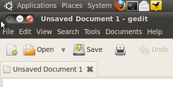
Screenshot (Credit: Chris Duckett/ZDNet.com.au)
In its current form, this is a minor annoyance as it is simply resizing the window it is acting upon, but once the close button is moved to the left, the target area of the most destructive button will be double the others — this has the potential to bite many an unwary user.
This sort of behaviour is an artefact from having curved window decorations. It works in a right-handed set-up as the space between the immediate right of the close button is on the right hand side and typically far away most other interface elements, such as menus and scrollbars.
But by moving the close button to directly above the File menu, an already crowded area of the desktop, Ubuntu got dangerous. At least having the close button on the inside meant it was difficult to hit by accident. Now Ubuntu has put an ejector seat button next to regular functionality.
The mob may have received some compromises from Shuttleworth, but Ubuntu has now taken a step which means everyone will lose something. Whether it be data, tabs, or that important email they were writing.