Responsive web images: What can we expect next?

With great power comes great responsibility, as Spiderman said — or was it Voltaire?
Responsive web design is indeed a very powerful tool. Through the use of a flexible grid, flexible images and media queries, it enables one website to be built for all web devices.
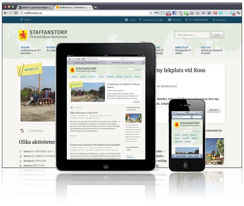
The Staffanstorp website in all its responsive glory — the only one on Flickr with a Creative Commons License.
But RWD, as it has become initialised, has opened a Pandora's can of worms, most notably with images. Matt Wilcox has written a thorough and thoroughly enjoyable analysis of the problems with responsive images. Namely:
- An image for a big screen may not be viewable on a small screen, so a subject in a group photo may need to be cropped to a headshot.
- Downloading hi-res images will waste bandwidth on a small screen.
To tackle this issue, we can use:
- A server-side approach, such as Wilcox's Adaptive Images, which works by creating images of various resolutions depending on the user's screen size.
- The announced but yet to be implemented
pictureelement, which provides a way to include different resolution images in the markup. - A new image format. Not as scary as it sounds, as JPEG can be adapted to work, and I'm sure that PNG files can be extended equally as well.
Obviously, there are pros and cons to each of the solutions. As a jobbing front-end web developer, the thing that keeps me awake at night — apart from Internet Explorer 7 — is the fear of bloat and redundant markup. This is the path that the picture element could take us down: putting references to multiple different images is surely stylistic and not do with semantics?
I think that for everyday web folk too much complexity in the HTML will be ignored or at best poorly implemented.
For those of us who are concerned with responsive images, would we not be best served by a server-side solution for now, and then a new image format for later?