Screenshots: Google's new global menu redesign

Imagine my surprise when I head to Google this evening and notice there is a new menu bar at the top of my screen. It only seems to work in certain accounts, and only appears through a convoluted set of steps, which now can't be reproduced.
Nevertheless, this is what I found. A new global menu design and a change in user aesthetics to Google's top menu bar.
As one of the most seen menus in the world, besides the traditional File, Edit, View on Windows machines, Google has a mighty job of ensuring that not only the menu bar is functional and works, but also that it is aesthetically pleasing.
So far, so good, I would say.
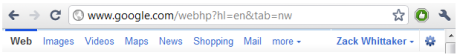
This is the new menu bar, with a highlighted stripe across the top of each area of Google. At the moment, all the colours remain the same - a light blue, but perhaps this will change over time.
When hitting the logged in username, presented is a feature similar to that in Windows Live, with a possibility of fast user switching to come. This was speculated last year and looks more like it could soon become reality.
And this shows a simple drop down menu for search settings and account settings, keeping the bar at the top simpler and less cluttered than before.
I have multiple Google accounts and this only shows on one account. Nevertheless, it does show the direction that Google is taking with its user aesthetics, similarly to that with Chrome: nudging everything it can into one simple bar across the top of the screen.
What do you think of the new redesign?