The Windows 7 UI will be the HP Slate's biggest weakness
HP has released a few teaser details of its upcoming iPad, um, I mean Slate device. While the company is betting the farm on Adobe Flash and AIR support being enough to give it the edge over the iPad, I can already see the device's biggest weakness - Windows 7. Or more specifically, the problems of taking a cursor-based desktop OS user interface (UI) and expecting the Windows paradigms, complete with little icons, small click areas, scrollbars and so on, to work well without a mouse.
Tag lines such as "access the full web and not just part of it" make it clear that HP is out to exploit the fact that Apple's iPad will give users, at best, offers a crippled web experience. But we shouldn't let this blind us into thinking that HP's Slate isn't without its faults.
Take a look at this video:
When I look at this video, what I see are the gotchas. Why? Because tablets aren't a new thing for me. I've been using tablets for years, and while I can see the upsides, I also see the downsides. Let's begin with here:
I don't know about you, but that Windows 7 taskbar is looking awfully crowded. While you might be fine with gross motor finger stabs at icons, I wouldn't like to try to manipulate anything. Partly because the icons are small, but also because they're so close to the edge of the screen. HP seems to recognize that the Windows Start Menu might not be all that handy for users and has created what looks like a Home screen, but launching applications is only one part of the problem.
Next -->
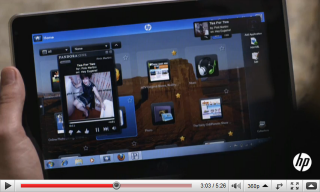
Problem is, the Windows desktop paradigm extends well beyond just the Windows OS. It's everywhere. Take a look at this:
What I see here is a sea of tiny controls, ranging from scrollbars to icons. Stuff that works great with a cursor, but suck when it comes to finger use.
Here's another example:
A sea of scrollbars and tiny elements to click on and manipulate.
We have reached a point where technology allows us to create a proper tablet PC. By proper, I mean something of the size and weight of a paperback book, rather than a coffee table hardback. Technology has also bought us touchscreens that don't require the use of a stylus. What's left is coming up with a UI that that's specifically designed for finger use, rather than cursor or stylus. While this UI wouldn't necessarily need to be designed from the ground up, thought would need to be given to each and every control that the end user is exposed to while using the operating system. Then, once the OS has an established touchscreen UI, you then have to wait for that to filter down to the developers, so that they use similar principals when designing applications.
This brings me to my final point - applications.
Another glaring problem with the tablet PC form factor is that once you've accepted that the OS UI is woefully inadequate, you then have to contend with the depressing fact that almost every application you'll ever want to use will be a horrible mess when it comes to usability. I can't think of a single desktop application that I use that has a UI that is anything better than execrable when it comes to tablet usage.
So, a Windows 7 based tablet will be a really nice thing ... until you try to use it.
<< Home >>