Transparency returns with a vengeance in Mac OS X Leopard


I remember sitting in the 2000 Macworld Expo San Francisco keynote when Steve Jobs showed Mac OS X's future Aqua interface to the crowd. It was a great change from the spare Rhapsody/OpenStep interface.
Observers at the time said that Aqua was "watery" because of the semi-transparent effects used for menus, buttons and other elements. I found it colorful and cheery.
Apple wanted something that would highlight the UI and technology differences between Mac OS X and Windows, and transparency became the poster boy. It wasn't a bad choice. It was very different on both accounts.
Other windowing systems of the time, Windows and the Classic Mac OS included, used a "switch" model that tracked the top-most window and displayed that image to the user. The pixels in each window on the screen were discrete and were switched when the user moved from window to window.
Mac OS X provided the Aqua UI and Quartz, a compositing engine that tracks each pixel of each window, understanding what the content is all about as well as its alpha channel information and text anti-aliasing, or drop shadows. When windows are layered on the screen, the engine recalculates each pixel on the screen, taking into account what's in the layers of windows, shadows, and transparencies upon transparencies. Each pixel on the display is an expression of that mixing.
There was a problem with this approach: the graphics hardware of that time couldn't keep up with all the overhead of compositing all these pixels. People on machines with modest power complained that Mac OS X was slow.
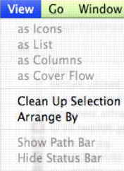
Quartz Extreme's graphics acceleration, introduced in the Jaguar release, aimed to help with the issue. Still, as Mac OS X was adopted by the wider Mac audience transitioning from the Classic Mac OS — many of whom were using under-powered machines — the transparency elements in the user interface were reduced. Starting with the Panther release [am I right about it being Panther?], not as much of that transparency was expressed in the Finder, even though the architecture was used in Apple applications and available to every program. (You can see that in the image above of the Tiger View Menu. There's a slight drop shadow but the menu is opaque.)
However, the translucent approach is all over Leopard. Take a look at the difference between the Tiger and Leopard pulldown menus (see below). You can see the open window and its file icons and names through the menu.
Another interesting expression of transparency is in the Quick Look pane. This new Mac OS X feature introduced in Leopard is a basic file browser that lets users see what's in a document without having to open the application, which might take a bit of time. Its smokey, transparent border surrounds the content (see below) and the whole look of the Quick Look pane separates itself from the solid treatment for document windows in applications.
Some Mac users hate this transparency. They say it makes the interface look "muddy."
I'm neutral on the topic of transparent menus. I don't know if it adds much but it doesn't rise to the level of hate. The transparent Quick Look pane is interesting and useful, especially if you keep items on the desktop while you're working. It lets you see items that might be covered up.
The return of transparency is a mark perhaps of the rising level of performance in the installed base of Mac graphics hardware. It's also enabled by the steady improvements in the Quartz and Core Graphics services, as well as the higher hardware requirements for Leopard.
Microsoft took this service/compositor approach in Windows Vista with the Windows Desktop Manager that powers the Aero interface. And like Apple did in the past, Microsoft has addressed parts of the installed base by either cutting out WDM from the low-end Vista SKUs or excluding the Windows Aero interface.
Perhaps this is one reason why Leopard marks the return of transparency to the Mac desktop: it shows potential customers that unlike Window Vista, there's just one flavor of Mac OS X Leopard for everyone and all get the "great" graphics handling and a translucent UI — whether they like it or not.