Web design: Stuck on the grid?

"Rules are for the guidance of wise men and the obedience of fools." Thus spake sweary pilot Douglas Bader. Replace 'rules' with 'grids', and you'll get the gist of how I approach CSS grid systems.
Mark Boulton has a most excellent introduction to grid systems, and his book Designing for the Web is available free online. However, I do take issue with his logic first, feeling second approach to grids.
In the past couple of years I have tried using a grid from scratch. However, I inevitably create the design until it feels right and then apply a grid retrospectively. Invariably — well, the half dozen times I've tried it — there is a grid that fits. And once you have a grid in place, then it's a breeze to create further pages and add additional elements.
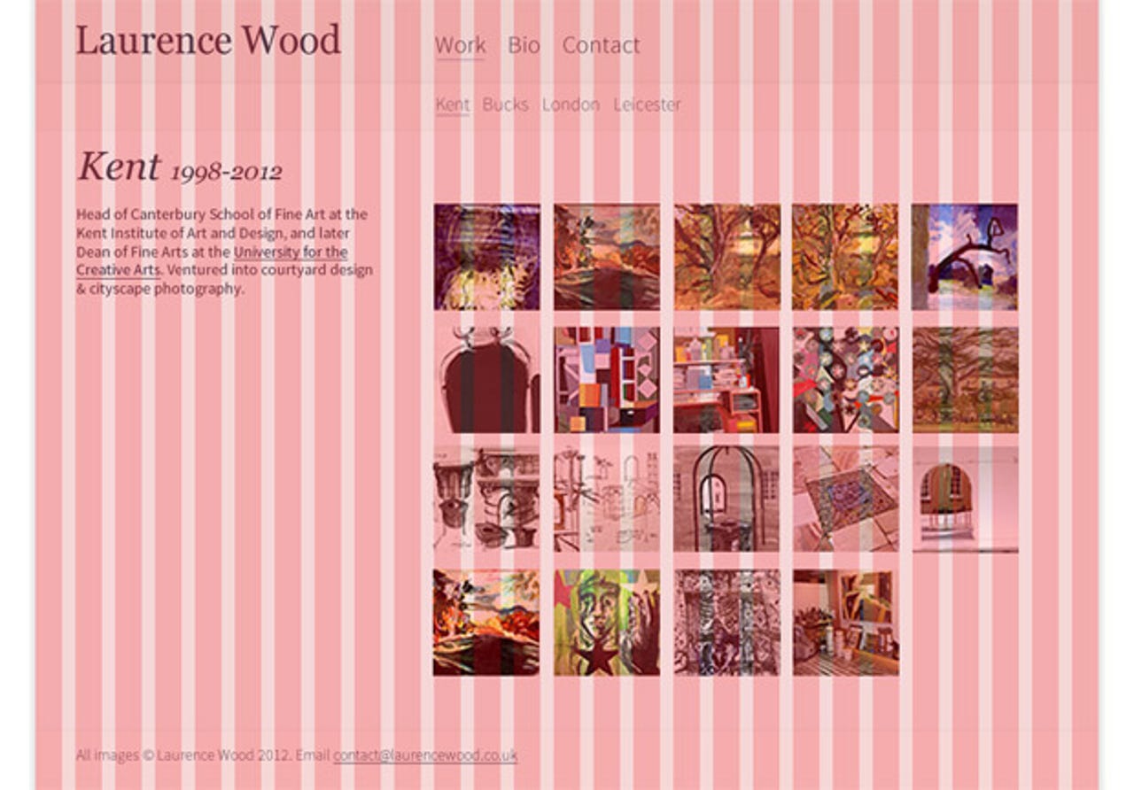
Take, for example, a responsive portfolio site I created for the artist Laurence Wood. I created it in Fireworks until it seemed right, and then added a grid using the excellent Grids extension for Fireworks. There is an equivalent extension for Photoshop called GuideGuide. Turns out I was using a 27-column, 24-pixel column width and 12-pixel gutter, and I didn't even realise it.
So my advice is do what feels right. If that means starting out with a grid, all well and good. But don't be shy of trusting the inner feeling of something being correct. Heck, you could even do some sketches with a pencil.