Can you rely on crowd-sourced mobile coverage maps?

How can you really tell whether your mobile phone provider is actually being truthful about coverage? Is crowd sourcing the answer?
As mobile data use continues to skyrocket, and mobile networks become more critical than ever, people are paying more attention to the sort of coverage they're getting from their mobile providers. The Telecommunications Industry Ombudsman (TIO) frequently cites coverage problems as being one of the most-complained-about issues with telecommunications companies in Australia.
Telstra, Optus, and Vodafone all have extensive coverage maps on their website that tell you exactly where you can get 2G, 3G, and in some cases 4G.
But how do we know they're accurate?
If you want to find out if a restaurant is good, you check out reviews on a site like Yelp. If you want a broad overview of whether a mobile operator has good coverage, prices, or customer service, you might check out a website like Whirlpool. But getting data about the coverage where you work or live is a bit more complicated.
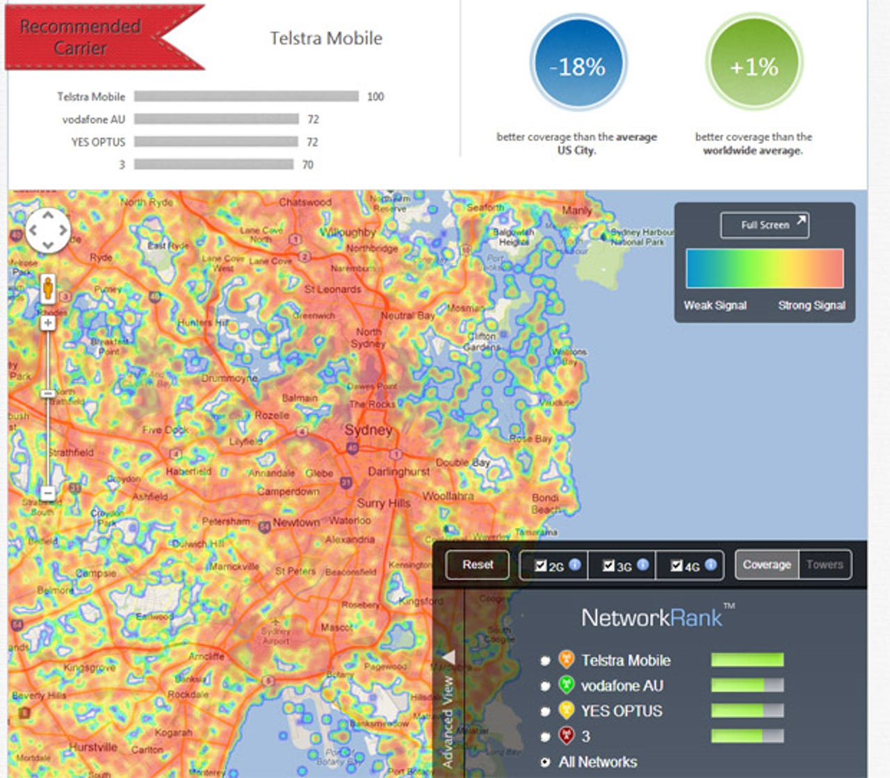
Getting an app that lets users collect their own data about mobile network coverage was inevitable, and there are a few around now. OpenSignal, for example, has coverage maps across the globe thanks to its Android app, and from the looks of it has extensive data covering a good portion of Australia. It ranks the telcos based on the performance the users have observed through the app.
The telcos I spoke to don't really believe much of the data to be accurate. For example, the ping for all telcos in Sydney sits at an average well over 300ms, which they believe to be far too high.
While the idea of crowd sourcing your telco coverage seems like a good one, there are many factors that people will have to take into account when determining their mobile coverage. What device the person is using and what spectrum bands it supports, whether they're inside or outside, the time of day they performed the test, and the number of users in a cell can all impact on the results.
Spaced out over a long period of time, too, I would wager that the results would skew quite a bit. Telstra Next G, for example, would have probably fared a lot better about 18 months ago, before it started adding millions of customers onto the network.
OpenSignal's community manager Samuel Johnston told me last week that he believes the number of users in Australia who have installed the app obviates the effect of any one sort of device skewing the results.
OpenSignal claims to have around 21,000 users across Australia, and has picked up millions of data points across the country. Johnston said he believes the data is more accurate than that provided by the telcos.
"Traditional carrier maps are based on projections, while ours are based on real-world readings. Our data is therefore more accurate than the maps that the carriers themselves use," he said.
Overall, 21,000 users is a drop in the ocean when Australia is ramping up to have 30 million mobile services. Australia doesn't even rank in the top 10 countries using the app right now, but with the release of an iPhone app soon, and potentially more users joining up, it'll be interesting to see how it fares in the long run.
What do you think? Is this the best way to find out what company has the best mobile coverage?