Apple, you really need to fix these stupidly outdated iOS design decisions

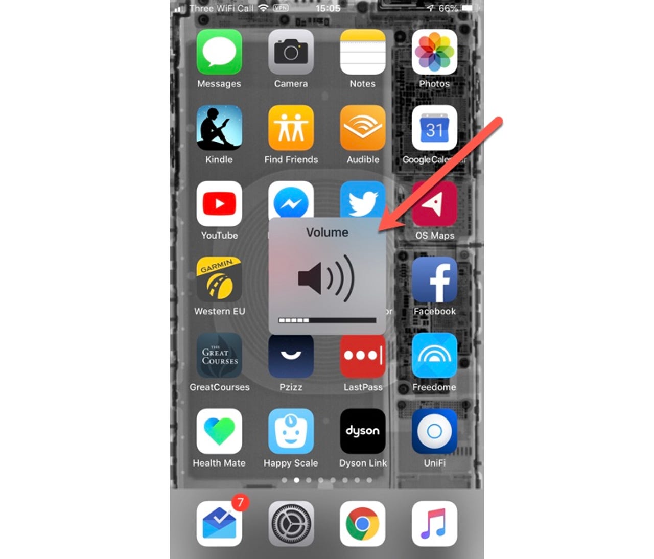
What's the deal with this floating volume display?
We're on iOS 12, and this is the best way Apple has come up with to display the volume on the Home screen. It's super-clunky, looks outdated, and feels like it takes over the display entirely.
Same with this...
Isn't there anywhere better that this could be displayed? These floating tiles date back to the earliest incarnations of iOS and not only look terrible but also get in the way of what you're doing.
Why is the Phone app a full-screen abomination?
I can sort of understand it when making a call (although I'm surprised Apple hasn't come up with something that works better), but having a full-screen app jump up into the middle of whatever you are doing when you receive a call is just plain antisocial.
Apple, please make incoming phone calls -- and FaceTime calls -- a notification that is subtle and easy to dismiss.
Why are active icons restricted to Apple apps?
Here are three icons. The Google Calendar icon is permanently stuck showing the 31st of whenever (this is an app I use all the time, and this annoys me), while Apple uses active icons for its apps that shows useful information (the icon for Calendar shows today's day and date, while the Clock icon shows the current time down to the second).
While I might be nervous about what some developers might do with the power to make icons active (developers can come up with really annoying things at times), having the option to have active icons (and the ability to make then static if required) would be an awesome iOS feature.
More UI oddities
Two things about the Home screen surprise me:
- The dock is fixed to four icons. Why not allow more icons and add the option to scroll?
- This horizontal scrolling paradigm for icon screens feels outdated. I'm unclear why I can't position icons where I want them (as opposed to having them grouped at the top of the screen), and to be honest I'd much prefer an update that made folders easier to use and a switch to continuous vertical scrolling rather than this page-by-page paradigm.
Why no Bluetooth icon?
In iOS Apple dumped the Bluetooth icon from the top of the screen (presumably to make space for the notch on newer handsets). But for those of us who switch Bluetooth off and on regularly it was a handy reminder of whether it was on or off.
I suppose that this feature is in the Control Center panel, so all is not lost, but it's still an odd thing to choose to remove. If the camera notch is a permanent fixture then perhaps Apple needs to reconsider where this information is made available.