An aesthete's take on iOS 7: Blinded by the white

Since the iPhone 5s/5c launch last month, the web has been flooded with sycophantic "reviews" of iOS 7 that either describe in gushing terms how beautiful its redesign is, or how Apple's design saviour Jony Ive has delivered a mobile operating system that has redefined contemporary standards of beauty for the 21st century.
This is all rubbish. After a few weeks with the new platform, I've realised that Apple's new mobile operating system is a half-baked, confused mess that mixes beautiful innovation with how-could-they-do-that face palming. iOS 7 is the technology equivalent of going home with a supermodel — and then spending the night on the couch because she's made a Dutch oven of the bed.
I'm sorry, I really am. I know we're supposed to accept every little gesture Apple makes, every little point-point upgrade as some sort of amazing revelation. I am a big fan, and I'm not change-averse. But while there are many features that finally work the way they should — sending multiple photos, for example, or easier access to settings, or more easily switching between and closing apps — others seem to have followed the change-for-change's-sake mentality in all the wrong ways.
The lock and home screens are a great example. While the iOS 7 lock screen is minimalist and slick, it's too much so, with a large, crisp clock hovering above a new-message list that is far too large and has margins that are far too large to be helpful. This is one case where less is definitely not more.
It may work well on the iPhone 5/5c/5s, which has more vertical real estate to display messages. However, on my smaller iPhone 4S screen, I can only see one message at a time because the clock and margins are so very, very large. Forget updates at a glance; if you want to see your new emails and alerts, iOS 7 demands your full attention and interaction. iOS 6 had this process working much more usefully, with several messages available for perusal.
Once you've unlocked the home screen, the cognitive dissonance is jarring. And I'm not just talking about the pointless and distracting way the icons drop into place on the home screen — pointless because it's a motif that does not appear anywhere else in the iOS 7 interface, and distracting because it serves no purpose whatsoever.
The slick white-on-black aesthetics of the lock screen are compromised with a completely different style of interface that simply does not flow from one screen to the next.
The slick white-on-black aesthetics of the lock screen are compromised with a completely different style of interface that simply does not flow from one screen to the next.
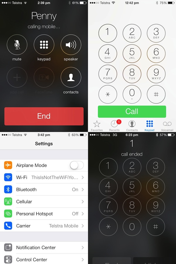
The PIN screen, for example, is a gorgeous, translucent, black-ish motif with buttons that seemingly glow when you press them. Start up the Phone app, and suddenly everything's black-on-white. Contacts are displayed as white screens with black text, as is the dialling keypad.
Yet, once you type a number and hit Call, you get a white-on-black screen that has the same aesthetic feel as the PIN-entry screen. Finish your call and it's back to black-on-white.
White, black. White, black. By the time you're finished with your phone call, your brain doesn't know what in the world is going on.
Then there's the home screen, which has replaced Apple's comfortable icons with minimalist alternatives that are not only unfamiliar, but ugly and counterintuitive. Had they been suggested for a DesignCrowd brief, I would have rejected them out of hand — but this, apparently, is the future of Apple design.
Voice Memos, in particular — an app that I use extremely regularly for work — has changed from being an intuitive microphone-style app to something that I think is supposed to represent an audio waveform, but looks more like the 1980s-era Defender spaceship. The app itself — black, on the whole — has been transformed from an intuitive, feature-limited, but very useful tool into something that looks like the illegitimate offspring of GarageBand and an electrocardiograph machine.
Seriously, what was wrong with a microphone motif? The problem with Apple's old skeuomorphic design wasn't its iconography or visual look; it was the selection and layout of features in the apps. And while Voice Memos seems to have a few more features, the need to completely relearn all of iOS 7's apps has created an unnecessarily and annoyingly steep learning curve.
Everything's turning to white
The main problem with Ive's minimalist redesign is the absolute dominance of white. This may have played out well in minimalist-design group meetings, but on an actual iPhone screen, it is overwhelming. I cannot use iOS 7 in an even moderately dark room because it hurts my eyes. Turning down the brightness does little except muddy the interface screen so everything is a difficult shade of grey.
White is everywhere: Unbalancing the Voice Memos, Safari, Calendar, and Notes icons; dominating the interface screens of Notes, Safari, Mail, and other apps. Photos are displayed, inexplicably, on a field of white — which distracts from the content of the photos — rather than black, which emphasises the photos and is much easier on the eye.
Featured
The top-of-screen command bar is also white, meaning there's no visually intuitive way to discern what's user information and what's the command bar. Indeed, in the camera app, the white and transparent control bars across top and bottom of the phone screens are so big, and so intrusive, that it has become impossible to see a significant portion of the photo you're taking.
It's like that old joke about the polar bear in the snowstorm — but in this case, it's no joke. Someone, somewhere, gave old Jony Ive a blank cheque to change iOS 7 in whatever way he saw fit — and he has proceeded to immolate the iOS 7 user experience that, while dated, was at least familiar and beautiful.
Worse still, while there is no way to change the design aesthetic, which has already driven me to repeatedly wish out loud that there was some way to downgrade back to iOS 6 until Sir Ive stops playing this cruel joke on all of us. At the very least, Apple could give us the option to have a white-on-black aesthetic instead of black-on-white. Black-on-white may play well on paper, but on a backlit smartphone screen, it's a disaster.
In the short term, I am telling anyone who asks me about iOS 7 to hold off upgrading until Apple comes to its senses in a subsequent upgrade. Family members who see it in action have actually banned me from upgrading their devices. I have expressed out loud that I wish I could get rid of it. Sure, some of the new features are great, and there are some nice touches — but when the overall user experience is so fundamentally irritating, it's hard to recommend iOS 7 yet, simply because of its frustrating, inconsistent user interface.
What do you think? Am I being too harsh on iOS 7? Or have you had the same issues with it? What else drives you crazy about it?
Related Stories