iOS 7: Does user experience really need a reboot?

I do not own a shopping-mall retail store, but I know from friends who do that one common requirement of lease contracts is that the owner of the business invest regularly in new shopfitting so as to keep the look and feel of the place as fresh as possible.
It can be a major investment – six figures, from what I'm told – and it's enough to drive many small businesses to shut up shop rather than make the investment. Sometimes it also confuses customers, who grow used to a particular layout or brand and can't find their way around the newly redesigned store. The magic may be there one day, but when you move everything around many customers will simply walk away in frustration.

After many weeks spent coming to grips with the rather different, power-hungry, over-modernistic design of Apple's iOS 7, I've come to the conclusion that this is largely what's happening with Apple's mobile operating system. Apple decided it was time for a change and, love it or leave it, certainly did change things.
For new users, it all looks shiny and new, although this is not always a good thing. For longtime iPhone and iPad users, it's just strange enough to cause that sort of conceptual disconnect that leaves us a bit shaken and bewildered. Icons look different; functions have been moved; the text-heavy design evokes the Web just a bit too much.
Overall, the whole feel of the new platform has come off as strange and unfamiliar – and, weeks later, it's still rather annoying. I've gotten use to it a bit more, as I'm sure you have – but there are still things I would do differently.
Apple could have done some other things differently, too – for example, by putting its weight behind its Touch ID fingerprint scanner or rethinking its questionable iPhone 5c.
The bigger issue with iOS 7, however, is its longer-term implications for software design.
I'm hardly surprising anybody to say that the whole tech industry watches Apple closely – particularly designers of software that runs on Macs and related devices.
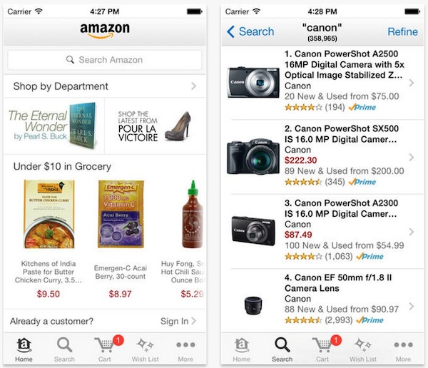
Many application designers follow Apple's every move in deciding how their own apps should look and feel, and many spent the weeks leading up to iOS 7's launch revisiting their look and feel, their icons, and their user interfaces (cf Twitter, Pandora, Facebook, eBay and others; here's an interesting list of 20 apps that have done so).
Does this mean the future lies in minimalist, sometimes confusing icons and text-based applications that take the fun out of the mobile interface? Hopefully not. And, yet, the bigger question is not just how how iOS 7 will affect the design and usability of the iPhone and iPad – but how it's spilling over into Mac OS X and, by extension, driving the direction of the desktop interface on Macs and other systems.
The bigger question is not just how how iOS 7 will affect the design and usability of the iPhone and iPad – but how it's spilling over into Mac OS X and, by extension, driving the direction of the desktop interface on Macs and other systems.
There's no question Apple has been bringing its apps towards the iOS interface for some time; it was several versions ago, for example, that it began standardising on the embossed-arrow-in-upper-left motif to go to the previous screen, and pushing towards the use of its Cover Flow method for displaying rows of images.
The increasing reliance on multi-touch gestures, the issue of the Magic Trackpad to allow something resembling a touch interface on the Mac – it all points to the iOS-ization of the desktop.
And, yet, there is the risk of pushing it too far – or polarising once dedicated and enthusiastic users: Microsoft's tiled Windows 8 has its share of fans, but it has also attracted derision and frustration from longtime users that find its mollycoddling just gets in the way of a good operating system.
Whether Apple would allow Mac OS X to get that far, I am not sure. Its obviously conscious decision to not just follow the pack and release touchscreen or pen-based PCs – which I have observed working quite well in certain situations – would seem to suggest it still sees a need to differentiate the computer and the mobile user experience.
And, yet, with each successive release of Mac OS X the differences are slowly being whittled away. The inclusion of Maps, Messages, Launchpad and more have given desktop users some familiar touchpoints, as has the shift towards App Store styled software distribution in recent years.
These advances could broadly be said to be good things, since they allow for consistency across the device interfaces and the portability of data between them. Yet, given the cognitive dissonance that iOS 7 has created for myself and many, many other users, it's also worth wondering just how much design change is a good thing; how much is just for change's sake; and whether our major OS vendors are now at risk of tweaking themselves so much that it's no longer a good thing.
What do you think? Are you a fan of the iOS 7 design conceit? Should the rest of the industry be following suit? Or is it time for some fresh thinking around the user experience? And, while we're at it: why is nobody copying the Android user interface?