Google Chrome's new UI is ugly, and people are very angry

Every major user interface (UI) redesign project is a hit and miss game, and Google's new Chrome UI appears to be a colossal miss.
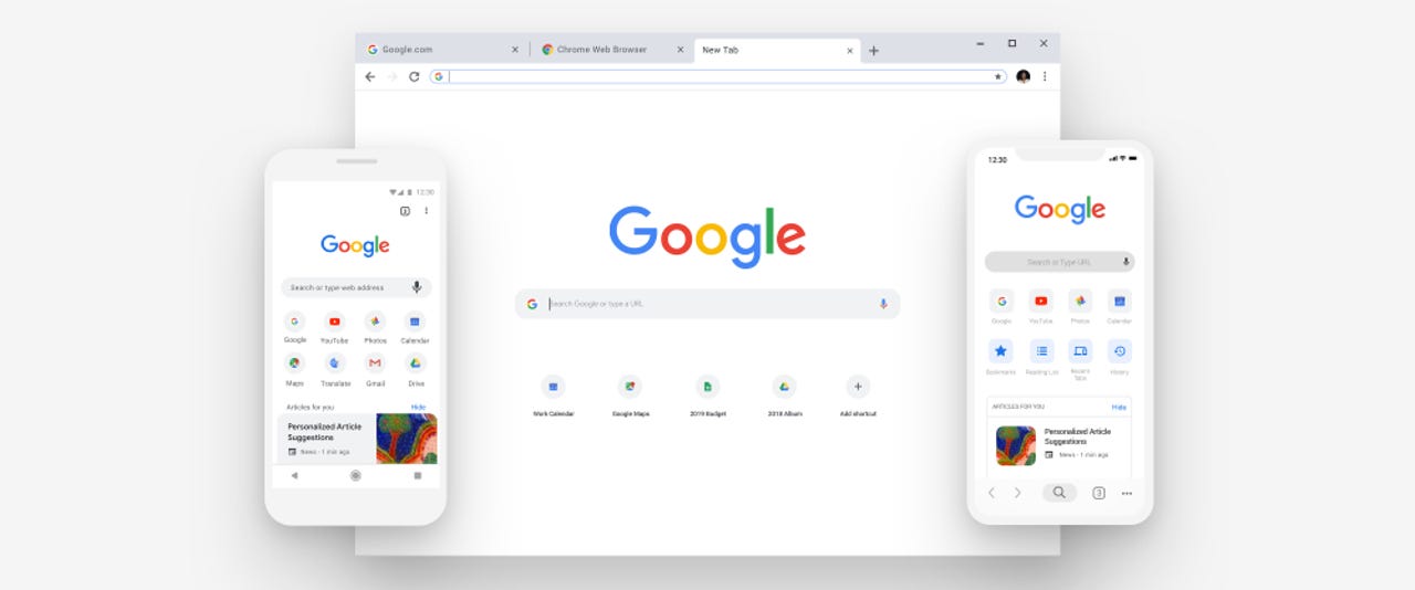
Designed with mobile devices in mind, the new Chrome user interface style was officially rolled out in September this year, with the release of Chrome version 69.
Not all users liked the new UI, and this was clear from the beginning, with some users voicing their discontent online even back then. However, those users who didn't appreciate the new lighter-toned Chrome interface had the option to visit the chrome://flags page and modify a Chrome setting and continue using Chrome's older UI.
But with Chrome version 71, released earlier this month, Google has removed the Chrome flag that allowed users to use the old UI.
As you might imagine, this change did not go well, at all. Chrome's new UI might have been developed with a mobile-first approach in mind, but the UI is problematic on laptops and desktops, where its lighter tone and rounded tabs make it extremely hard to distinguish tabs from one another, especially when users open multiple tabs.
Since being able to distinguish and switch between tabs at a fast pace is an important detail in most of today's internet-based jobs, many users have been having trouble adapting to the new UI both at work and at home, especially if they're the kind of people who deal with tens of tabs at the same time.
A social media storm
For the past two to three weeks, social media sites like Reddit and Twitter have been flooded with complaints about Chrome's new UI and users wailing about not being able to switch back to the old style.
These complaints aren't just from a handful of annoyed users. There are tens of Reddit threads about how the new UI sucks, and how people want their old Chrome tabs back. The complaints, from hundreds of users, go on, and on, and on, and on, and on, and on, and on, and on, and on, and on, and on, and on, and on, and on, and on, and on, and on, and on, and on, and on, and on, and on, and on.
Feedback about the new Chrome UI on Twitter is just as bad as it is on Reddit, with the same grievances being aired over, and over, and over, and over, and over, and over, and over, and over, and over, and over, and over, and over, and over, and over, and over.
Most of the complaints that Chrome users are bringing forward are legitimate. It is incredibly harder to find a desired tab on the tab bar with the new UI, compared to the old one. Furthermore, Chrome's new UI also broke users' ability to mute tabs, which is an inconvenience of its own.
Chrome devs recommend other browsers, but no downgrade
The way most users have been reacting to this forced UI update is by downgrading Chrome to versions 70 and earlier, where they could force the old UI as the default Chrome interface.
There are so many users saying that they are downgrading that Google engineers have stepped in to tell people to switch to other browsers rather than use an old Chrome version.
"Please don't do this. As a Chrome dev, we would really rather you use another browser than try to lock yourself on an old version of Chrome," said Google engineer Peter Kasting. "There are serious consequences to this, and much like choosing not to be vaccinated, the choice affects other people besides just you."
But Kasting, who's been doing damage control on Reddit for the past few months, is also urging users not to give up on Chrome, despite the new UI.
"The easiest thing to do would be to just stay on Chrome," he said. "With nearly all users we've talked to who've done this, they don't mind the new UI after using it for a couple weeks, it's just the initial adaptation that's a shock."
What Google is going through right now isn't something new. Mozilla went through the same pains at the end of the 2000s when they introduced the much-hated Australis UI, a major reason why many Firefox users switched to Chrome in the first place.
Microsoft, too, went through the same aches and pains in the early 2010s when it switched from the Aero UI in Windows 7 to the flat-looking Modern (formerly Metro) UI in Windows 8 and later.
The difference is that Microsoft listened to its users and the Modern UI has seen major changes since them --like bringing the Start button back after Microsoft removed it from Windows 8.
Mozilla didn't listen to its users, and the Australis UI was the default Firefox style since last year, when Mozilla launched the much more inspired Quantum UI.
The new Chrome UI is not that bad, but tweaks to its tab bar are definitely needed. Just like Microsoft and Mozilla, Google is not going to bring the old UI back, but if they know what's good for them, they won't ignore this vocal feedback from its userbase, otherwise, they might see Firefox-like consequences.
Best Google Chrome extensions for productivity, security, and performance (2018 edition)
More browser coverage:
- Firefox 64 released with a Windows-like task manager
- Google working on blocking Back button hijacking in Chrome
- Microsoft confirms that Chrome extensions will run on new Edge browser
- Brave browser moves to Chromium codebase, now supports Chrome extensions
- Malicious sites abuse 11-year-old Firefox bug that Mozilla failed to fix
- Half of the Tor Project's funding now comes from the private sector
- Brave is the default browser on obscure HTC crypto-phone CNET
- How to use Opera's Flow to sync your desktop and mobile browsers TechRepublic