Here's what Samsung's new One UI looks like on a Galaxy S9

A look at Samsung's new One UI Android Skin
In early November, Samsung revealed One UI, the company's refined approach to its proprietary Android skin.
The new look features more whitespace and tweaks throughout the entire design.
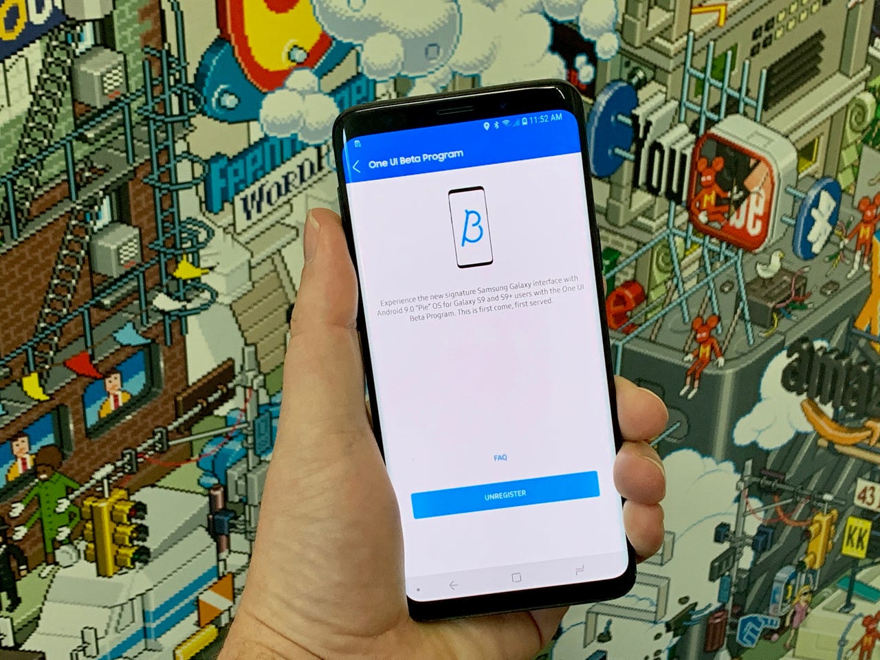
Samsung recently opened registration for the One UI beta program, allowing Galaxy S9 and S9 Plus users to participate in testing and providing feedback.
Naturally, curious about all of the new changes, we enrolled a Galaxy S9 of our own into the beta program. What follows are some of One UI's changes and new features.
Different from the start
The moment you turn on a One UI device, you're greeted with Bixby's voice, welcoming you to your new device, and asking if you want to get started on the setup process.
As you can see in the top-right corner of each screenshot, you can silence Bixby with a tap on the speaker.
The entire process feels very similar to the Windows 10 setup process with Cortana.
See also: Bixby is another good reason to buy the Galaxy Note 9
Bold fonts, lots of whitespace
As you can see, whitespace and big, bold, text are prominent throughout the setup process. Even the fingerprint registration screen makes sure you can see everything.
New notification look, app icons
Most everything on One UI now has a rounded feel to it. From the notification dropdown, to the new navigation bar icons, to the new app icons -- rounded corners on everything.
Multitasking view is revamped
The multitasking button in the navigation bar is now made up of three vertical lines. That's because One UI displays open apps on a horizontal line, displaying each app's preview with a swipe to the left.
It's the same approach Apple uses with iOS, and what Google uses in Android Pie 9.0.
Android Pie 9.0!
That's because the One UI update also brings Android Pie 9.0 with it. This is the Android Pie Easter Egg found in settings on the Galaxy S9.
Quick settings is now full screen
Part of Samsung's apporach to One UI is to make interacting with content on the screen easier, even when the phone is being used with one hand.
In order to do that, One UI displays various elements down lower on the screen, as you can see here with the quick settings tile that now takes up the entire screen.
Everything moves down
The same approach was also taken within various Samsung apps, such as Messages and Settings.
The top of the interface features the same big font, while the lower portion puts the interface within reach of your thumb.
And yes, the screenshot overlay is new
For those curious, even the screenshot tool has been redesigned.
More options along the bottom
In apps like Phone and Gallery options that previously had been located along the top of the interface have been moved to the bottom of the screen.
Again, making them easier to reach.
New app icons
Samsung's own app icons have been redesigned. The Gallery app, for example, is now red and has the outline of a flower inside it.
Always-On Display
The Always-On Display now features a large area for the time and date, with app notification icons just below it.
Tap on the notificaitons to expand and see the full alert.
Night Mode
A new Night Mode can be manually turned on. When on, the system interface turns black, including Samsung's own apps.
The black interface saves on battery as well as makes it easier on your eyes to look at the display in a dark environment.
The setting indicates there's an option to have Night Mode turn on based on the time of day and your location, but the setting doesn't appear to work yet.
This is a beta, after all.
All gesture navigation
Android Pie introduced gesture-based navigation to Android.
Samsung is giving users the option to use gestures for navigation, or use the standard navigation bar with a home and back button.
Scene Optimizer feature in the camera
A new Scene Optimizer mode in the camera app is included in the One UI update.
The feature claims to improve photos by adjusting the color to match the subject of the photo.