A deeper dive into Windows 8

The Windows Developer Preview has been out for a month, and I've had a chance to look more closely at its features. Here's an overview of details, small and large, many of which you haven't seen before.
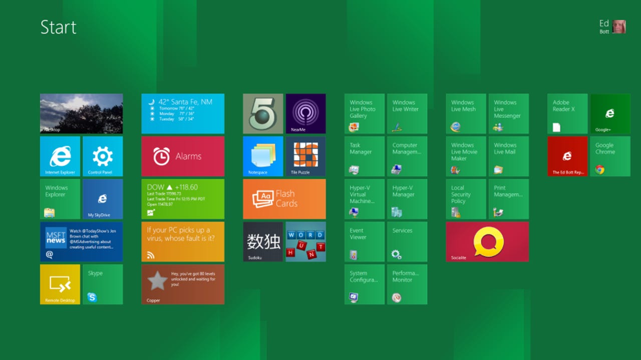
One feature I like about the new Start screen design is that it scales for different screen sizes. Here, for example, is a 1920 x 1080 24-inch display. It offers five rows of tiles instead of the three rows on a 1366 x 768 screen.
This heavily customized Start screen invludes several live tiles that display regularly updated information - weather, stock prices, and news headlines - in a data dashboard format.
The absence of any serious Metro style apps makes it hard to judge the platform, but you can get some clues from the sample apps. For example, the Stocks app allows you to enter a stock symbol and then "pin" the real-time trading information for that stock to the front page.
The more I use Windows 8, the more I realize it was designed as a “search first” experience. That search experience as implemented in the Windows Developer Preview is incomplete, especially when it comes to working with files. The ability to see full previews is essential, for example, and missing here.
I expect this to be a popular Windows 8 configuration. The Windows desktop (with all your familiar programs) in a full pane, and a new Metro style app docked to the side.
You can also pin two Metro apps side by side. This configuration lets you keep an eye on stock prices while you keep your mind sharp playing Sudoku.
The ribbonized Windows Explorer still offers the filtering tools available in its predecessor. It also greatly simplilfies the views available. Those two icons in the lower right corner allow you to switch between list and icon views.
If you're a power user, here is one example that should win you over to the ribbonized Windows Explorer immediately. Sometimes you need to see file name extensions, but most of the time you want them turned off. In the Windows 8 Explorer, it takes two clicks to show extensions: one to switch to the View tab, a second to select this check box, and one more click to hide extensions when you're done. Contrast that with 10 clicks to accomplish the same task in Windows 7.
For my money, the new Task Manager is the single greatest improvement in the new Windows 8 desktop. Besides having a cleaner, more readable design, it also consolidates useful details that used to be scattered in other locations. In addition to seeing how much memory is in use, for example, this Performance tab tells you how many physical DIMMs are installed and what clock speed they're running at.
Likewise, the CPU view on the Performance tab in Task Manager gives you a visual display about resource usage as well as cold hard facts. Look closely and you can see the processor name, its clock speed, and how much L1 and L2 cache it includes.
As an exercise, one of the first things I did after installing the Windows Developer Preview was to take inventory of all the little applets and utilities that survived from previous Windows versions. Not everything got a makeover. The Windows Fax and Scan app, for example, still uses Vista-style toolbars!
I appreciate the layout and responsiveness of the default onscreen keyboard. A nice touch? If you tap the Ctrl key, you can see which keys are available as shortcuts. One design decision I don't understand is the curious omission of two keys: there's no Windows key, and there's no Alt key. That makes a surprising number of standard shortcuts literally impossible to use with the onscreen keyboard.
The onscreen keyboard includes a full layout of smileys. Press the Advanced key (in the lower left corner) and you get a set of interesting (and possibly useful) symbols.
A simple swiped gesture from the top or bottom displays the address bar at the bottom of this page, with open browser tabs at the top.
Sites you visit frequently automatically appear on the New Tab page in the Metro style Internet Explorer. Sites you pin to the page appear in a group to the right. Note how large and touch-friendly these tiles are.
Typing a search term in the address bar allows you to see a filtered view of your browsing history, with only matching shortcuts included. On a 1366 x 768 tablet, the keyboard takes up more than half the screen!
Use the new Magnifier control to zoom in on a page (in this case, a setting in the immersive Control Panel).
The SmartScreen filter in the Metro style IE works like its desktop cousin. This red page indicates a dangerous site and a potentially dangeroud download.
SmartScreen filtering is another feature that is getting a serious expansion in Windows 8. The feature was originally introduced in Internet Explorer and has been steadily improved through the years, with impressive results. For Windows 8, the protection extends to all files, not just those downloaded through Microsoft's browser.
Windows Defender is now a full-fledged antivirus program, integrated into Windows 8. Here, it's providing a discreet notification that it blocked a dangerous file from being copied to the system.
If the new Windows Defender looks a lot like Microsoft Security Essentials, that's no accident. The two programs share the same engine and antivirus signatures.