In Australia, a museum experience that seduces and shocks

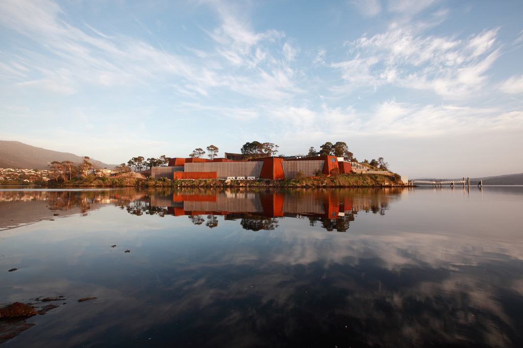
HOBART -- The grey-washed winter day is an appropriately dramatic setting for my first visit to the Museum of Old and New Art (MONA). After a short ferry jaunt, the monolithic complex comes into sight, perched on top of sandstone cliffs jutting out into the Derwent River, its unassuming façade giving nothing away. As I climb the concrete stairs, I’m left wondering: Is this really it? Is this the so-called "Disneyland for adults"?
In January 2011, MONA opened its doors to a flurry of visitors — its art, tech gadgets, architecture and owner, the gambler millionaire David Wash — received both praise and criticism. From all the public hype and respected news reports, I expected MONA to be more than just a splatter of muted colours and rusted steel-coated buildings.
As I reached the top of the peninsula, the populist appeal of MONA dawned upon me. Set on the scenic 3.5-hectare Moorilla vineyard estate(also owned by Walsh), the museum is surrounded by every conceivable indulgence — tennis courts, swimming pool and sauna, the “Moo” brewery, the Moorilla winery, the contemporary French Source restaurant, and two cafes that all help to fuel the art binge.
If you can afford to, you can even sleep at the museum. Highrollers can choose to stay at one of eight high-tech, flashy pavilions, named after a prominent 20th-century Australian architect (Roy Grounds, Robin Boyd, Esmond Dorney and Walter Burley Griffin) or painters (Charles Blackman,Brett Whiteley,Sidney Nolanand Arthur Boyd).
The $175m museumis an underground cave full of old and new art treasures from part of Walsh’s $100m private collection. The museum covers6,000m2, with three levels connected by a spiraling staircase and a glass elevator that metaphorically takes you down into your subconscious — a quarry of dark thoughts.
Entry to the museum is via black-mirrored double doors -- perhaps Walsh’s version of going down the rabbit hole? It’s dark -- there are no signs, no clear pathways and no linear narrative to follow. The labyrinthine floor plan, designed by acclaimed Melbourne architect Nonda Katsalidis, has been created specifically for self-exploration.
Later Walsh tells me that the building is deliberately underwhelming. “Public galleries are big, in-your-face statements about all that we know as a society,” he says. “The architecture is a signal that we have a lot to learn. I was determined to remove the concept of a privileged viewpoint from my art; my visitors strive to understand, each in his own way.”
As I pay the A$20 ticket, I am inducted into this museum philosophy by the“O” — an iPod like device.
Acting as a personalized museum guide, the O hangs over my head and plugs into my ears, supplying me as much, or as little information as I want, and identifying nearby artworks based on my location.
I start at the ever-popular Paurisis Gallery (where only two people at a time are admitted). Entering a dimly lit room, I follow the square, white stepping-stones placed across water (too easily mistaken as black flooring), which then leads me into another room with two cabinets.
On the left cabinet is the mummy Paurisis and on the right, a digital version of the mummy. It’s a fancy display of theatrics -- unnecessary perhaps, but impressive all the same.
I look to my O and select "explore other rich content", which covers categories such as "summary", "ideas", "art wank" (explanatory comments or further facts about the work), "Gonzo" (artist interviews) and "media" (music).
The O also makes it quite clear that while you are not expected to know much about the art, you are expected to have an opinion. One of the most prominent features of the O is that it asks you to rate the artworks as either "Love" or "Hate."
When prompted, I select "Love" for the bit.fall by German artist Julius Popp, which takes (in real-time) the most popular words on the Internet and turns this into a waterfall [there’s great video footage of the waterfall in action on the Discovery Channel], a science-meets-art statement on contemporary culture.
The O feeds back to me that a percentage of MONA visitors also agreed with me. It’s socially affirming technology.
I was both fascinated and appalled at the grotesque Cloaca Professional (by Will Delvoye), a machine that turns food into excrement — smells included.
There's also the subversive On the road to heaven the highway to hell — Stephen Shanbrook’s remnants of a suicide bomber, cast in dark chocolate— and the visually confronting portraits of female genitalia by Melbourne sculptor Gregory Taylor.
At some point of the museum journey, I'm given the option to "save the tour" by supplying my email address. The O tells me that I can log in to the MONA website after my visit and view a 3D model of the tour plus any other content that is made available on the O.
Sure, there’ve been mobile and audio guide systems like the O before, but none have quite compared to the level of detail and interactivity — it's simple, clever and a generation beyond any existing technology of its kind that's been produced.
Developed by the locative mobile experts Art Processors, the O is the first mobile interpretive solution designed to replace wall labels and traditional signage.
The device is powered by a dense wireless network and dedicated real time location system that are used in conjunction with the custom mobile application and content management system.
The O was created because Walsh had a strong desire to depart from the white cube presentation that dominated contemporary museum design. As such, he challenged Art Processors to create the technology that would enable his vision of a label-less museum.
As Tony Holzner, Art Processors CEO and Co-Founder, puts it,“It enables exhibition designers and curators to display the works the way they want, without constraint. It promotes exciting gallery layouts and dramatic lighting, showcasing exhibits in harmony with the physical space, free from distraction.”
Walsh has indicated that in future he may want to move works around in the gallery based on Love/Hate feedback collected by the O — in other words, the public would decide (to an extent) where these artworks should be placed. A form of curatorial crowd-sourcing perhaps?
As I exit the MONA for the ferry, I'm left thinking about Walsh. Is he a true visionary or just an eccentric rich man on a soap box? Both? Whatever the verdict, we can't deny that MONA has issued a serious challenge to museums everywhere to rethink their user experience.
Photos: (main) MONA/Leigh Carmichael2, (insert) ArtProcessors Pty Ltd.
This post was originally published on Smartplanet.com